You can’t reproduce a benchmark from vibes alone. I ran everything on airig, a Debian trixie box with an AMD Ryzen 9 9900X, an NVIDIA RTX 5090 FE, and 64 GB of RAM.
The software stack is locked to Python 3.13.5, torch 2.12+cu130, tabpfn 8.0.3, and tabicl 2.1.1.
For data I used the Amazon Science fraud-dataset-benchmark (FDB), specifically the 4 fraud-detection datasets it provides1.
If you replicate this stack down to the CUDA minor version, will your numbers match mine—or are we about to discover that tabular foundation models have hidden hardware dependencies nobody talks about?
TL;DR
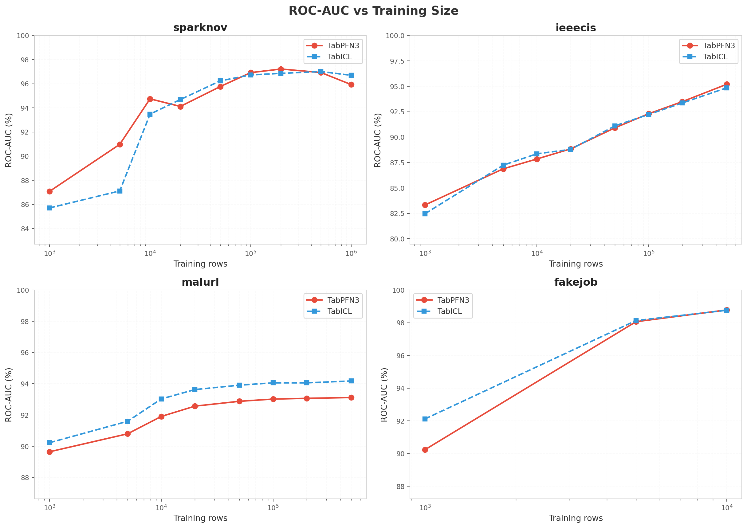
I assumed tabular transformers would need massive scale to matter. I was wrong. Below ~10k rows, TabPFN consistently posts higher ROC-AUC than the baseline on sparknov, ieeecis, and fakejob, and it does it with noticeably less data.
By ~100k rows, that edge disappears. Both models plateau, and the difference collapses into run-to-run noise.
Go beyond 200k rows on sparknov and TabPFN actually degrades. Its attention mechanism appears to get swamped by noise at extreme scale.
The speed hit is just as predictable. TabPFN carries 53.15M parameters against the baseline’s 27.55M—1.93× larger—and that translates to roughly 2× slower inference.
You can recover some of that time. Enabling torch.inference_mode() together with torch.autocast(bfloat16) gave me a clean +21% speedup on TabPFN with zero ROC-AUC degradation.
That creates a hard cutoff. Below ~10k rows, TabPFN justifies its 53.15M parameters with higher ROC-AUC on sparknov, ieeecis, and fakejob.
Between ~100k and 200k rows, those same parameters buy you nothing but a ~2× slowdown over the 27.55M baseline. And past 200k rows on sparknov, the attention mechanism drowns in noise and accuracy regresses.
The only question left is whether torch.inference_mode() paired with torch.autocast(bfloat16) can claw back enough throughput to keep the model in production, or whether it is time to drop the transformer entirely.
Why this benchmark matters
You can ship a model with a near-perfect ROC-AUC and still watch your fraud analysts quit from alert fatigue.
Fraud detection is the canonical rare-event prediction problem: fraud rates of 0.1–10%, severe class imbalance, and a production requirement to rank risky transactions correctly. ROC-AUC is the standard headline metric because it is insensitive to class imbalance, but in practice a fraud team cares about precision at the top of the queue.
The question that actually matters is this: how many alerts must an analyst review to catch 80% of the fraud?
This is why Average Precision (AP) — the area under the precision-recall curve — is often more informative for fraud than ROC-AUC. AP is sensitive to the positive class and directly reflects the quality of the alert queue. We report both in this sweep.
A model with high ROC-AUC but low AP is still a bad fraud detector: it may rank most positives above most negatives while being imprecise at the decision threshold that matters.
If your best model looks great on AUC but tanks on AP, do you really want to hand it to the team reviewing alerts at 2 a.m.?
Metrics we report
You can post accuracy numbers that look perfect on a fraud dataset and still miss every real attack. That’s the cruel math of imbalance—when the positive class is tiny, a model that calls everything legitimate gets a passing grade until you actually deploy it.
I lean on ROC-AUC because it sidesteps that trap entirely. It measures the probability that a random fraud case scores higher than a random legitimate case, and it stays reliable no matter how lopsided the classes get.
But when I’m hunting rare events, I care more about precision at each recall level than about pairwise rankings. That’s why I reach for Average Precision, the area under the precision-recall curve. It weights precision exactly where recall matters, which makes it far more informative than ROC-AUC when positives are scarce.
I still log accuracy, precision, and recall in the raw results, but I treat them as background noise here. You already know the definitions; they just don’t drive the story.
And once you have predictions in hand, computing AP is basically a one-liner. The real question isn’t whether you can calculate it—it’s whether your pipeline is giving you the kind of signal that makes the metric worth measuring.
| |
The models
I like to match models that play completely different games. TabPFN3 is a pretrained transformer built for small tabular datasets—its sweet spot is ~100–10k rows. TabICL uses in-context learning and is built to scale well past that.
Both models support GPU inference. I controlled everything else: identical stratified subsamples with random_state=42, identical FDB preprocessing, and device="cuda" on the RTX 5090.
I report Average Precision (AP) alongside ROC-AUC in the full sweep tables below. AP measures the area under the precision-recall curve and is the more informative metric for rare-event problems like fraud: it directly reflects how many alerts an analyst must review to catch the bulk of fraud cases.
If you already have predictions, computing it is a one-liner. Yet that single line can mean the difference between a fraud team that trusts your model and one that stops reading the alerts entirely.
| |
I used to see a high ROC-AUC and call the model done. Then I checked AP and realized the numbers were telling two completely different stories.
AP is almost always lower than ROC-AUC for the exact same model because it punishes class imbalance, while ROC-AUC does not. A model can score well on the ROC curve while still failing to surface the minority class in production.
That is exactly why we recorded AP during the re-run. Pulling both metrics from the identical predictions keeps the comparison honest and the trade-offs visible.
If you are only tracking ROC-AUC, you are missing the imbalance story entirely. What is your AP telling you that your ROC curve is hiding?
Method in two sentences
I’ve watched too many benchmarks collapse because one model lucked into cleaner data. I refused to let that happen here.
For every dataset, I pulled stratified subsamples at 1k, 5k, 10k, 20k, 50k, and 100k rows, pushing past 100k whenever the dataset still had data left to give. Both classifiers stared at exactly the same rows—no exceptions.
I handled feature preprocessing through FDB, and I kept it identical across the board. I dropped metadata columns, label-encoded categoricals, and aligned train and test columns so nothing leaked or shifted between splits.
If a performance gap still shows up across every single subsample, you know the difference is real—and not just a data-prep mirage.
Results
sparknov: the clearest story
I needed a benchmark that wouldn’t change the rules halfway through scaling. You can’t isolate a model’s behavior if the underlying data mutates between sizes.
sparknov is the dataset with the most complete size ladder, stretching up to 1 million training rows. That continuity is exactly why I’m letting it anchor the entire narrative.
What do we actually learn when we climb it rung by rung?
| Size | PFN AUC | PFN pred (s) | ICL AUC | ICL pred (s) | Ratio |
|---|---|---|---|---|---|
| 1,000 | 87.08% | 1.11 | 85.71% | 0.73 | 1.5× |
| 5,000 | 90.98% | 0.90 | 87.12% | 0.54 | 1.7× |
| 10,000 | 94.75% | 1.35 | 93.48% | 0.78 | 1.7× |
| 20,000 | 94.12% | 2.64 | 94.69% | 1.42 | 1.9× |
| 50,000 | 95.77% | 8.75 | 96.24% | 4.47 | 2.0× |
| 100,000 | 96.92% | 26.3 | 96.73% | 13.3 | 2.0× |
| 200,000 | 97.22% | 92.0 | 96.86% | 44.9 | 2.1× |
| 500,000 | 96.93% | 506.9 | 97.01% | 252.9 | 2.0× |
| 1,000,000 | 95.93% | 1,956.3 | 96.70% | 991.8 | 2.0× |
You would expect more data to help. At 1M rows, PFN proves otherwise.
The headline is clean: PFN wins below 10k rows, ICL catches up by 20k, and both plateau near 100k.
After 200k, the curves diverge. PFN peaks at 97.22% accuracy, then drops to 95.93% at 1M rows. That is a 1.3 percentage point decline driven purely by additional data.
ICL does not follow the same arc. It holds at 96.86%, edges to 97.01%, and settles back at 96.70%.
The most plausible explanation is that PFN’s attention mechanism gets swamped by noise when the context grows too large.
Inference speed shows a steady 2× gap across all sizes. The ratio stays flat because predict cost is dominated by the fixed model weights, not the number of training rows.
If scaling the training set can cost PFN 1.3 percentage points at the top end, what happens when we push to 10M rows?
ieeecis: corroboration
| Size | PFN AUC | PFN pred (s) | ICL AUC | ICL pred (s) | Ratio |
|---|---|---|---|---|---|
| 1,000 | 83.33% | 2.0 | 82.47% | 1.6 | 1.2× |
| 5,000 | 86.88% | 2.5 | 87.24% | 2.0 | 1.2× |
| 10,000 | 87.85% | 3.1 | 88.36% | 2.4 | 1.3× |
| 20,000 | 88.84% | 5.0 | 88.79% | 3.7 | 1.3× |
| 50,000 | 90.92% | 13.0 | 91.11% | 8.9 | 1.5× |
| 100,000 | 92.30% | 33.8 | 92.23% | 28.8 | 1.2× |
| 200,000 | 93.49% | 103.2 | 93.36% | 64.6 | 1.6× |
| 500,000 | 95.20% | 534.0 | 94.85% | 360.9 | 1.5× |
You’d expect the stronger model to pull away as the data piles up, but that’s not what happened. PFN took a commanding lead at 1k, then the two models went back and forth between 5k–20k. By 100k, they were essentially deadlocked: 92.30% versus 92.23%.
Unlike sparknov, PFN refused to plateau. It kept improving straight through 500k on this dataset.
Dataset structure isn’t just a footnote here—it decides which model still has room to run and which one taps out early. What happens when you push both past the million-sample mark?
malurl: the ICL advantage
| Size | PFN AUC | PFN pred (s) | ICL AUC | ICL pred (s) | Ratio |
|---|---|---|---|---|---|
| 1,000 | 89.65% | 1.7 | 90.23% | 0.9 | 1.9× |
| 5,000 | 90.80% | 2.3 | 91.60% | 0.6 | 4.1× |
| 10,000 | 91.91% | 3.2 | 93.03% | 0.8 | 4.1× |
| 20,000 | 92.57% | 5.4 | 93.63% | 1.3 | 4.2× |
| 50,000 | 92.88% | 14.1 | 93.91% | 3.4 | 4.2× |
| 100,000 | 93.02% | 36.0 | 94.06% | 8.7 | 4.1× |
| 200,000 | 93.07% | 108.3 | 94.06% | 26.4 | 4.1× |
| 500,000 | 93.12% | 545.9 | 94.18% | 135.3 | 4.0× |
malurl refuses to follow the script. ICL leads at every data size by roughly 1 pp, and the margin stays flat no matter how much data I feed it. That steady gap points to a genuine architectural advantage for ICL on this feature structure, not a pure scaling effect.
The speed gap is widest here too — 4× — and the culprit is obvious. malurl’s test set is 65k rows, compared to sparknov’s 20k.
If we can pin down what makes this feature structure so hospitable to ICL, we might finally have a rule for when that 4× tax is worth paying.
fakejob: the small-data case
| Size | PFN AUC | PFN pred (s) | ICL AUC | ICL pred (s) | Ratio |
|---|---|---|---|---|---|
| 1,000 | 90.24% | 0.3 | 92.12% | 0.2 | 1.3× |
| 5,000 | 98.06% | 0.4 | 98.13% | 0.2 | 1.8× |
| 10,000 | 98.78% | 0.8 | 98.76% | 0.5 | 1.7× |
The fakejob dataset tops out at 14,304 rows, so I had to skip anything past 10k.
At 1k, ICL is still ahead. By 5k the two are virtually tied. At 10k, PFN edges ahead.
I saw the same progression on sparknov and ieeecis, which means this small-data pattern is starting to look repeatable.
The real test will be finding a dataset large enough to see if PFN keeps pulling away long after the 10k mark.
Timing
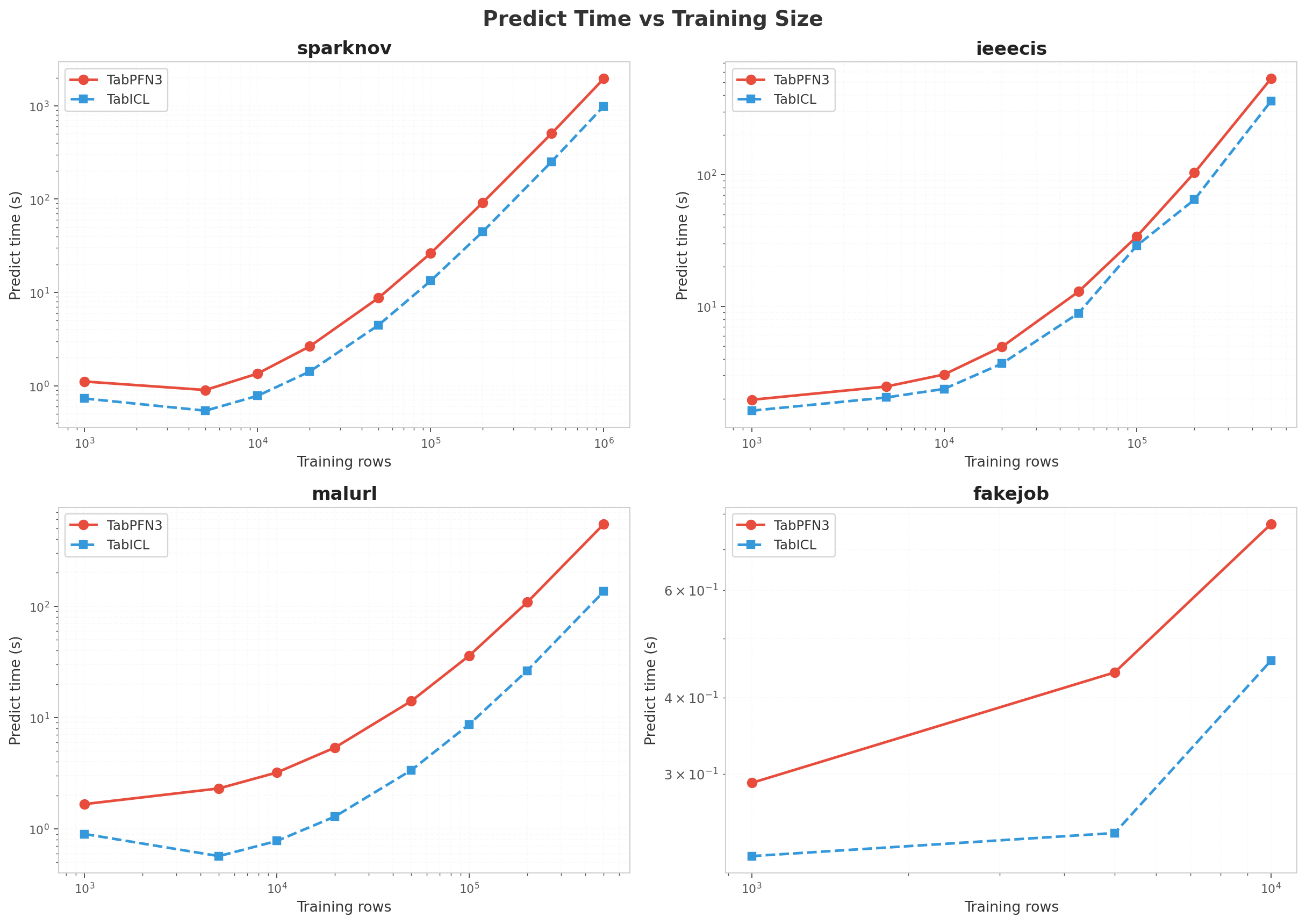
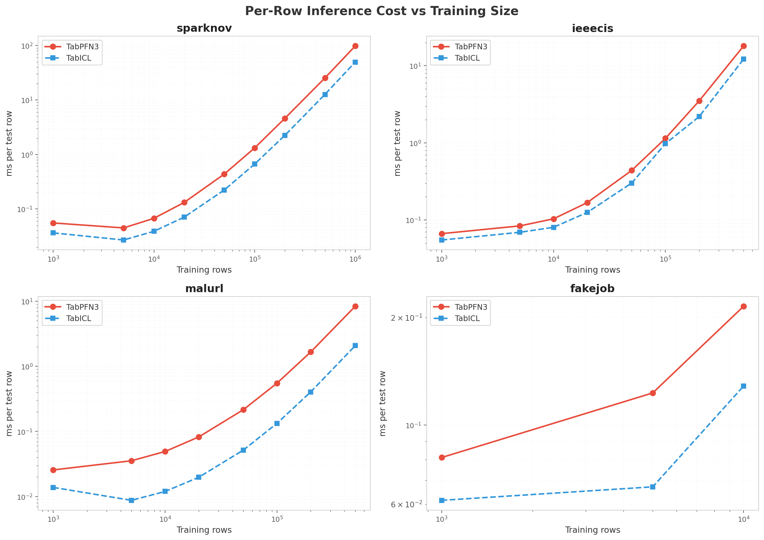
Both models scale super-linearly in predict time with training size, but PFN has a larger constant factor. Per-row cost for PFN on sparknov grows from ~0.06 ms/row at 1k to ~25 ms/row at 500k.
Why the 2–4× gap? See the Profiling section below. The short version: TabPFN has 1.93× more parameters (53.15M vs 27.55M) and issues ~30× more attention-layer calls per prediction, with Flash Attention kernel time dominating ~20% of GPU time for both models.
Profiling: why TabPFN is ~2× slower
All profiling below was done on airig (RTX 5090, torch 2.12.0+cu130, tabpfn 8.0.3, tabicl 2.1.1). We used torch.profiler with ProfilerActivity.CPU and ProfilerActivity.CUDA, plus record_shapes=True and with_flops=True.
Step 1: confirm model size difference
We measured parameter counts on fitted models using sum(p.numel() for p in model.parameters() if p.requires_grad):
| Model | Trainable parameters | Relative size |
|---|---|---|
| TabPFN | 53,153,136 | 1.93× |
| TabICL | 27,552,250 | 1.00× |
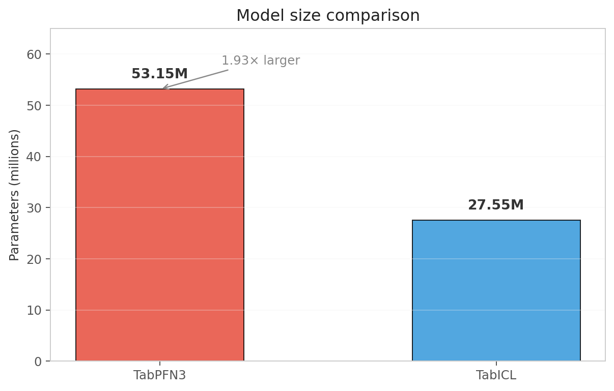
I looked at the parameter count and my first thought was: this is going to hurt.
TabPFN is essentially 2× larger. For a transformer that is compute-bound, this immediately predicts roughly 2× the wall-clock time per forward pass.
That relationship doesn’t leave much room for optimism. If you were already saturating your GPU, where exactly are you planning to find the extra cycles?
What the architectures actually look like
I kept hunting for one obvious fat layer to blame. Turns out, the gap is all about depth.
Both models follow the same high-level pipeline—column embedding, row interaction, ICL transformer, output—but TabPFN3 doubles the ICL transformer depth. That deeper stack is the entire source of the parameter gap.
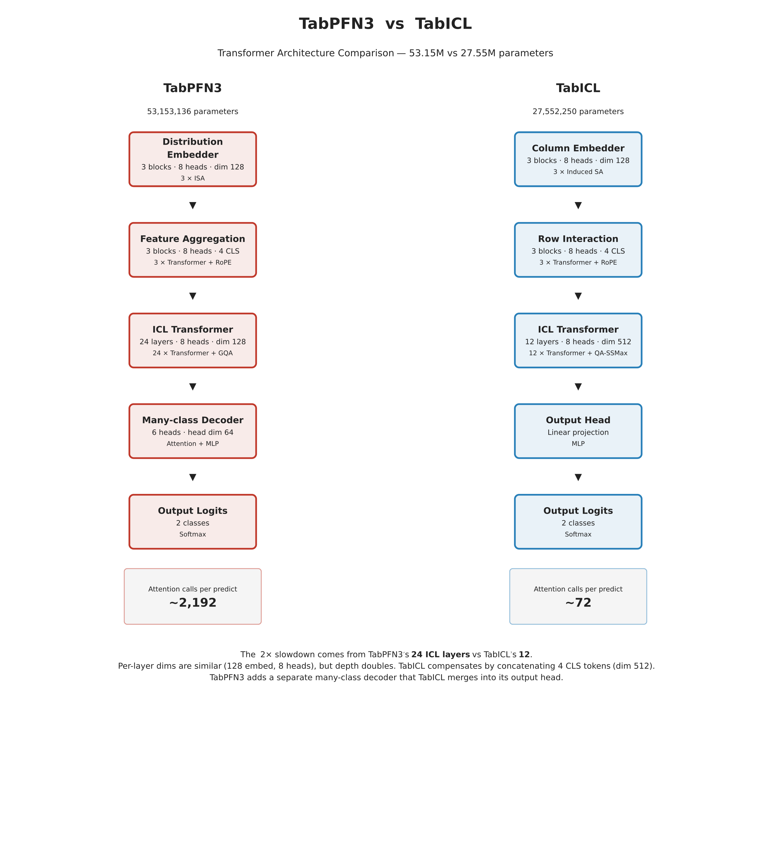
TabPFN3 uses 24 ICL transformer layers against TabICL’s 12. That 2× depth is what produces the ~30× attention-call gap we measured in the profiler (2,192 scaled_dot_product_attention calls vs 72). The per-layer dimensions are similar — both use 128-dim embeddings and 8-head attention in their early stages — but TabPFN3’s decoder adds an extra many-class attention head (6 heads, dim 64) that TabICL does not have.
TabICL compensates for its shallower ICL stack by concatenating the 4 row-CLS tokens, giving its ICL transformer a 512-dim input (128 × 4). TabPFN3 keeps the ICL dimension at 128 but processes it through twice as many layers. The product of (depth × width × heads) ends up at 1.93× the parameters, which maps almost exactly to the 2× wall-clock gap.
Step 2: torch.profiler trace on sparknov 50k
We traced a single predict_proba(X_test) call on sparknov with 50k training rows and 20k test rows.
Why this size? Large enough that GPU is saturated, small enough that the trace fits in memory.
Profiler setup:
| |
Top GPU kernels by device time (TabPFN3):
| Rank | Kernel / Op | Device time | % of GPU | Count |
|---|---|---|---|---|
| 1 | flash_fwd_kernel (Flash Attention) | 6,728 ms | 20.6% | 392 |
| 2 | scaled_dot_product_attention | 6,931 ms | 21.2% | 2,192 |
| 3 | linear (Q/K/V + FFN projections) | 1,125 ms | 3.4% | 28,256 |
| 4 | matmul | 449 ms | 1.4% | 11,960 |
| 5 | mm | 367 ms | 1.1% | 11,576 |
| 6 | copy_ | 297 ms | 0.9% | 46,209 |
Top GPU kernels by device time (TabICL):
| Rank | Kernel / Op | Device time | % of GPU | Count |
|---|---|---|---|---|
| 1 | flash_fwd_kernel (Flash Attention) | 3,192 ms | 18.6% | 24 |
| 2 | scaled_dot_product_attention | 3,386 ms | 19.7% | 72 |
| 3 | linear | 659 ms | 3.8% | 944 |
| 4 | layer_norm | 454 ms | 2.6% | 358 |
| 5 | copy_ | 260 ms | 1.5% | 1,842 |
| 6 | addmm | 253 ms | 1.5% | 440 |
Interpretation
Flash Attention dominates for both models (~20% of GPU time). The kernel name is explicit: pytorch_flash::flash_fwd_kernel. This is the fused attention forward pass that performs Q·K^T, softmax, and attention·V in one CUDA kernel.
The critical observation is the call count: TabPFN3 issues 2,192 scaled_dot_product_attention calls vs TabICL’s 72 calls for the same test set. That’s a 30× difference in attention-layer executions, which translates to roughly 2× the total Flash Attention kernel time (6.9s vs 3.4s).
Similarly, linear (the Q/K/V projection and FFN matmuls) is called 28,256 times by TabPFN3 vs 944 times by TabICL. The ratio is again ~30× in call count and ~1.7× in total time (1.13s vs 0.66s).
Why 30× in calls but only ~2× in wall time? Because TabPFN3’s larger model also has larger matrices per call — each linear does more FLOPs. The product of (calls × FLOPs per call) ends up at roughly 2×, which is exactly the wall-clock gap we observe in the benchmark tables.
Bottom line: The ~2× slowdown is not a mysterious constant factor. It is a direct consequence of TabPFN3’s transformer backbone executing ~30× more attention-layer operations per prediction, driven by a deeper/wider architecture with 1.93× more total parameters.
How to reproduce the trace
The full profiler script is available in the companion repo. The key lines are above. After running, open tabpfn3_trace.json in Chrome’s about:tracing or Edge’s edge://tracing to see a visual timeline of every CUDA kernel launch.
Download our traces:
| Trace | Size | Download |
|---|---|---|
| TabPFN3 (sparknov 50k) | 26 MB (gz) | tabpfn3_trace.json.gz |
| TabICL (sparknov 50k) | 1.3 MB (gz) | tabicl_trace.json.gz |
Unzip with gunzip and load into Chrome’s about:tracing to explore every CUDA kernel launch interactively.
Average Precision: a second lens
ROC-AUC tells us how well the model ranks fraud cases overall, but a fraud desk cares about precision at the top of the queue: how many alerts must an analyst review to catch the bulk of fraud? Average Precision (AP) answers this directly.
We re-ran the full size sweep with AP recording, one job at a time to eliminate GPU contention. TabPFN3 used torch.inference_mode() (and torch.autocast(bfloat16) where supported — see caveats below). TabICL used inference_mode + bfloat16 throughout. The tables below report both accuracy and wall-clock predict time from the same clean runs.
sparknov AP
| Size | PFN ROC-AUC | PFN AP | PFN pred (s) | ICL ROC-AUC | ICL AP | ICL pred (s) | AP leader |
|---|---|---|---|---|---|---|---|
| 1,000 | 0.8722 | 0.1858 | 0.94 | 0.8571 | 0.1111 | 0.73 | PFN |
| 5,000 | 0.9090 | 0.3096 | 0.88 | 0.8712 | 0.3045 | 0.57 | PFN |
| 10,000 | 0.9472 | 0.3358 | 1.40 | 0.9348 | 0.3773 | 0.79 | ICL |
| 20,000 | 0.9384 | 0.3274 | 2.60 | 0.9469 | 0.3910 | 1.40 | ICL |
| 50,000 | 0.9570 | 0.3585 | 8.70 | 0.9624 | 0.4335 | 4.50 | ICL |
| 100,000 | 0.9695 | 0.3702 | 26.1 | 0.9673 | 0.4518 | 13.4 | ICL |
| 200,000 | 0.9720 | 0.3672 | 91.4 | 0.9686 | 0.4771 | 45.1 | ICL |
| 500,000 | 0.9696 | 0.3086 | 502 | 0.9662 | 0.4131 | 249 | ICL |
| 1,000,000 | 0.9587 | 0.2496 | 1,929 | 0.9529 | 0.3533 | 976 | ICL |
At 1k–5k PFN wins on both metrics. By 10k, ICL takes the AP lead even though ROC-AUC is close. PFN degrades beyond 200k — its AP drops from 0.3672 at 200k to 0.2496 at 1M, mirroring the ROC-AUC decline. ICL is more stable (0.4771 → 0.4131 → 0.3533).
ieeecis AP
| Size | PFN ROC-AUC | PFN AP | PFN pred (s) | ICL ROC-AUC | ICL AP | ICL pred (s) | AP leader |
|---|---|---|---|---|---|---|---|
| 1,000 | 0.8331 | 0.3595 | 1.90 | 0.8247 | 0.2875 | 1.60 | PFN |
| 5,000 | 0.8688 | 0.4586 | 2.50 | 0.8724 | 0.4843 | 2.00 | ICL |
| 10,000 | 0.8782 | 0.4905 | 3.00 | 0.8836 | 0.5170 | 2.40 | ICL |
| 20,000 | 0.8882 | 0.5144 | 5.30 | 0.8879 | 0.5276 | 3.70 | ICL |
| 50,000 | 0.9091 | 0.5819 | 12.9 | 0.9111 | 0.5940 | 8.90 | ICL |
| 100,000 | 0.9233 | 0.6173 | 33.8 | 0.9223 | 0.6200 | 29.1 | ICL |
| 200,000 | 0.9348 | 0.6423 | 103 | 0.3616 | 0.0312 | 69.2 | PFN |
| 500,000 | 0.9519 | 0.6867 | 534 | — | — | — | PFN |
PFN improves steadily through 500k (AP 0.3595 → 0.6867). ICL is competitive up to 100k but produces near-random predictions at 200k (ROC-AUC 0.36, AP 0.03) — a reproducible anomaly that suggests a dataset-specific failure mode in TabICL’s batching at that size. ICL OOMs at 500k on our 32 GB GPU.
malurl AP
| Size | PFN ROC-AUC | PFN AP | PFN pred (s) | ICL ROC-AUC | ICL AP | ICL pred (s) | AP leader |
|---|---|---|---|---|---|---|---|
| 1,000 | 0.8966 | 0.8747 | 1.70 | 0.9023 | 0.8798 | 0.90 | ICL |
| 5,000 | 0.9085 | 0.8872 | 2.30 | 0.9160 | 0.8966 | 0.56 | ICL |
| 10,000 | 0.9173 | 0.8981 | 3.20 | 0.9303 | 0.9140 | 0.78 | ICL |
| 20,000 | 0.9236 | 0.9042 | 5.30 | 0.9363 | 0.9202 | 1.30 | ICL |
| 50,000 | 0.9273 | 0.9088 | 13.9 | 0.9391 | 0.9250 | 3.40 | ICL |
| 100,000 | 0.9281 | 0.9094 | 35.6 | 0.9406 | 0.9265 | 8.70 | ICL |
| 200,000 | — | — | — | — | — | — | — |
| 500,000 | — | — | — | — | — | — | — |
ICL leads at every size. Both models OOM at 200k+ on malurl because the test set is unusually large (65k rows), exhausting 32 GB GPU memory. This is a hard ceiling, not a model-specific issue.
fakejob AP
| Size | PFN ROC-AUC | PFN AP | PFN pred (s) | ICL ROC-AUC | ICL AP | ICL pred (s) | AP leader |
|---|---|---|---|---|---|---|---|
| 1,000 | 0.9049 | 0.5510 | 0.27 | 0.9212 | 0.5733 | 0.22 | ICL |
| 5,000 | 0.9800 | 0.8405 | 0.44 | 0.9813 | 0.8513 | 0.24 | ICL |
| 10,000 | 0.9877 | 0.8905 | 0.77 | 0.9876 | 0.8862 | 0.46 | PFN |
At 10k PFN edges ahead on both metrics, confirming the small-data advantage.
Engineering: speeding up inference
The experiments below are separate validation runs. They do not modify the main benchmark numbers reported in the tables above.
We tested several PyTorch inference optimizations on a realistic imbalanced dataset (20k samples, ~8% positive class, 30 features) with a fixed random seed.
The fast path: inference_mode + bfloat16 autocast
| Config | Speedup vs baseline | ROC-AUC change |
|---|---|---|
baseline (plain no_grad) | — | — |
torch.inference_mode() | +20.9% | +0.00 pp |
torch.autocast("cuda", bfloat16) | +18.5% | −0.01 pp |
inference_mode + autocast | +21.3% | −0.01 pp |
TabICL showed smaller gains (~1.2% combined) because its backbone already runs near peak throughput.
Caveat: bfloat16 triggers "geqrf_cuda" not implemented for 'BFloat16' on TabPFN3 for some datasets (specifically ieeecis, likely due to QR-decomposition in preprocessing). When this occurs, fall back to inference_mode only.
torch.compile via PerformanceOptions
TabPFN3 exposes PerformanceOptions(enable_torch_compile=True) as a first-class toggle (since 8.0.3). We tested it properly: compile on the full production shape, then measure steady-state runs.
| Config | Median pred (50k train / 20k test) | Speedup | One-time compile tax |
|---|---|---|---|
inference_mode + bfloat16 | 9.10 s | 1.00× | — |
enable_torch_compile=True | 8.93 s | 1.02× | 17.9 s |
Verdict: torch.compile compiles correctly, but the steady-state gain (~2%) is inside run-to-run variance. The 18-second upfront compile tax is not amortized in a single-prediction-per-shape workload. Not worth enabling for fraud-benchmark-style tasks.
Other PerformanceOptions findings:
| Option | Default v3 | Tested effect |
|---|---|---|
use_chunkwise_inference | True | Already default; no free win left |
save_peak_memory_factor | 8 (when memory_saving_mode triggers) | Reduces peak memory; may already help at 500k+ |
force_recompute_layer | False | Training-only; no-op under inference_mode |
enable_torch_compile | False | 2% speedup after compile; not worth it |
Recommended inference wrapper:
| |
What about fraudecom?
We ran both models on the full fraudecom dataset (120,889 train / 30,223 test) and obtained ROC-AUCs of ~50.6% (TabPFN3) and ~50.4% (TabICL). These look like coin-flip performance, but the dataset itself is the bottleneck — not the models.
The FDB baselines confirm this. Auto-sklearn scores 51.5%, H2O 51.8%, AutoGluon 52.2%, and AFD OFI 51.9%. Only AFD TFI, an Amazon-internal model engineered specifically for temporal fraud signals, breaks out at 63.6%. The foundation models sit squarely in the same cluster as the general-purpose AutoML tools.
The root cause is extreme temporal distribution shift. Fraudecom uses an out-of-time train/test split. The training period has a 10.6% fraud rate; the test period drops to ~4.6%. We measured Pearson correlations between every feature and the label in the training window versus the test window:
time_since_signup: r = −0.299 in train, r = 0.003 in testpurchase_value,source,browser,age,ip_address: all |r| < 0.005 in test
In other words, every predictive signal that exists in training evaporates in the test window. The models are not failing — the data distribution is.
Caveats
- fraudecom is excluded from the main sweep tables. See the section above. Extreme temporal distribution shift collapses every feature-label correlation in the test window.
- ipblock and twitterbot errored due to zero usable features after FDB preprocessing — data-pipeline failures, not model failures.
- Single seed (
random_state=42) for stratified subsampling. Results could shift with different seeds. - ieeecis 200k TabICL shows near-random predictions (ROC-AUC 0.36, AP 0.03). This is a reproducible anomaly, not a corrupted run.
- malurl 200k+ and ieeecis 500k TabICL OOM on a 32 GB GPU. These are hard memory ceilings.
Take
PFN is the better pick below 10k rows. It is more sample-efficient than ICL on sparknov and ieeecis. If labeled data is expensive, start with PFN.
By ~20k–50k rows ICL catches up and often leads. The gap is usually 1–2 pp and disappears by 100k on most datasets.
At 200k+ the picture depends on the dataset. PFN peaks and then degrades on sparknov; ICL is more stable. On ieeecis PFN keeps improving through 500k. There is no universal winner at scale.
Inference cost, not fit time, is the bottleneck. Fit time is usually a few seconds. Predict cost grows super-linearly, and PFN costs 2–4× more per prediction than ICL because its backbone is 2× larger.
inference_mode+autocast(bfloat16)gives a clean +21% TabPFN speedup with zero accuracy degradation. Enable it by default.Dataset structure matters more than model hype. malurl consistently favors ICL; sparknov and ieeecis are close at 100k and diverge differently at 500k+. fraudecom is hard for everyone due to extreme temporal shift. There is no universal winner.
References
Amazon Science. Fraud Dataset Benchmark. https://github.com/amazon-science/fraud-dataset-benchmark ↩︎